
May 2016:
 March 2014:

March 2014:
Friday, December 9, 2016
Thursday, December 8, 2016
Because I need the User-defined line settings
Created a simple ratio graph at FRED and put a user-defined line on it:

Then I created a link to the Page Short URL. Then I said Oh, my trend line is gonna be messed up. So I looked at it, to see:

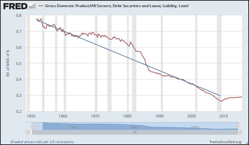
Sure enough. The user-defined line put my end-value at 2016, not at 2009 where I had it. Obviously they saved the value I specified for the end of the user-defined line, but they didn't save the date. Great.
(Or maybe they save the date, but don't apply it when they reconstruct the graph. That would be a much easier fix!!)
For the record, here's the data I specified for the user-defined line:
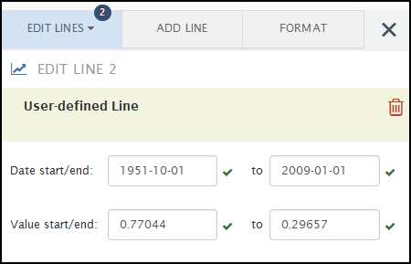
And here's the data as returned by FRED c4Kd:

I didn't check, but FRED probably doesn't save (or apply) the start-date for the user-defined line, either.
Then I created a link to the Page Short URL. Then I said Oh, my trend line is gonna be messed up. So I looked at it, to see:

Sure enough. The user-defined line put my end-value at 2016, not at 2009 where I had it. Obviously they saved the value I specified for the end of the user-defined line, but they didn't save the date. Great.
(Or maybe they save the date, but don't apply it when they reconstruct the graph. That would be a much easier fix!!)
For the record, here's the data I specified for the user-defined line:
And here's the data as returned by FRED c4Kd:
I didn't check, but FRED probably doesn't save (or apply) the start-date for the user-defined line, either.
Monday, November 28, 2016
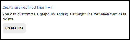
"Create user-defined line? Create user-defined line? Create line"
Unbelievably, FRED lets you create a line by specifying the endpoints, but does not let you put the line on the right-hand axis.
(Also, it seems not to remember the end-date you specify, when you save a link to your graph.)
(Also, it seems not to remember the end-date you specify, when you save a link to your graph.)
Tuesday, November 8, 2016
418,000 US and international time series from 79 sources ...
418,000 US and international time series from 79 sources, but nothing on Gross Federal Debt before 1939:

Sunday, October 16, 2016
Why why why why why?
I go to FRED to look for data and to look at data. Sometimes I have to hunt. Sometimes I know what I'm looking for. When I know what I'm looking for I can just type the name into the search box and get the graph. Sometimes.
Sometimes not. Sometimes I get this:

Why? Why give me a list with one thing on it? Why not just give me the thing?
This problem comes up a lot. I've noted it here and here, for example. Well, it's not a "problem" I guess. But it's annoying.
Sometimes not. Sometimes I get this:
Why? Why give me a list with one thing on it? Why not just give me the thing?
This problem comes up a lot. I've noted it here and here, for example. Well, it's not a "problem" I guess. But it's annoying.
Wednesday, October 12, 2016

Monday, October 10, 2016

Saturday, September 24, 2016
Poor frequency evaluation
If you try to create a scatter plot at FRED, a lot of times you'll get an error message like this one:
It seems to me that if it's quarterly data, "end of period" and "end of quarter" mean the same thing. If so, FRED has no valid objection to creating the scatter plot.
I think the code that checks the frequency of the data needs an update. Looks to me that they're doing a simple character-by-character text comparison, when they should be doing a little evaluation of frequency settings.

For scatter plots, both plot in a pair must have the same frequency. The following plot pair has been skipped: plot #1 with frequency Quarterly, End of Period and plot #2 with frequency Quarterly, End of Quarter.
It seems to me that if it's quarterly data, "end of period" and "end of quarter" mean the same thing. If so, FRED has no valid objection to creating the scatter plot.
I think the code that checks the frequency of the data needs an update. Looks to me that they're doing a simple character-by-character text comparison, when they should be doing a little evaluation of frequency settings.
Sunday, September 11, 2016
Is it CMDEBT / GDP or is it GDP / CMDEBT ?
I just downloaded an Excel file from FRED. As it happens, I have two graphs on the screen: CMDEBT relative to GDP, and GDP relative to CMDEBT. I decided to use the data from the GDP relative to CMDEBT graph. So I downloaded that, opened the file, and glanced at the column header above the first data. CMDEBT_GDP, it says.

Did I download data from the wrong graph? I had to stop and check.
This happened to me once before, just the other day. I didn't know what the problem was, but I did notice the fluke. So I was ready for it when I found it just now.
When I first made the graph it showed CMDEBT. Then I added GDP. So I think that's what the CMDEBT_GDP is, a list of the data series in the order they are added to the graph. It definitely does not show the data relation, which is GDP / CMDEBT.
Maybe this isn't a big deal, if you know about it. But if it catches you by surprise it can mess up your work.
I don't know if this happened in the days before FRED's May 2016 revision. I don't think it did happen, but I can't say for sure.
Thursday, September 8, 2016
There's probably a reason for this...
Today is Thursday, 8 September 2016. I'm looking at the FRED series CMDEBT. Just above the graph, to the left, it tells me the value of the most recent data item (Q1 2016: 14,316.00) and when the series was last updated: Jun 9, 2016. That all makes sense.
Now, down below the graph are the Notes, and among the notes the Suggested Citation. And the citation ends thus:
Where the hell did August 22 come from? This is Thursday, 8 September. The graph was updated on 9 June.
August 22?
Now, down below the graph are the Notes, and among the notes the Suggested Citation. And the citation ends thus:
... [CMDEBT], retrieved from FRED, Federal Reserve Bank of St. Louis;
https://fred.stlouisfed.org/series/CMDEBT, August 22, 2016.
https://fred.stlouisfed.org/series/CMDEBT, August 22, 2016.
Where the hell did August 22 come from? This is Thursday, 8 September. The graph was updated on 9 June.
August 22?
Tuesday, July 5, 2016
They fixed one!
After the 2014 revision to the FRED Graph system, you could add what they called a "trend line" to your graph. I poked a little fun at that before. Here's a pic of the option they offered:

Here's a pic of the option now, after the 2016 revision:
It is no longer called a "trend" line. Now it is a "user-defined" line.
I'd like to think it was all my doing, that they no longer call the thing a trend line. I know it wasn't. But what the heck.
Thanks, guys. Thanks for fixing that.
Sunday, July 3, 2016
How about a Duplicate button
How about a Duplicate button -- so after I put together some data and a calculation, and get a line on a graph, I can hit Duplicate to put a second line on the graph based on the same data and the same calculation. Then I could revise the second line as needed, rather than recreating it from scratch.
Thursday, June 30, 2016
Here's a thought
At FRED for some reason they provide Household Debt Service Payments as a Percent of Disposable Personal Income, but they don't provide Household Debt Service Payments in Billions of Dollars.

Almost always (in my experience) when they offer a ratio series, they also offer the components of the ratio separately. So this would be the exception that proves the rule wrong.
I can make an assumption. I can assume that they used the DPI series when they figured the ratio. I'm pretty confident in that. And I can use DPI along with the Household DSP as a Percent of DPI series to get DSP in billions. It works for me.
It's early in the morning, though, and I have to be careful with the calculation or I'll screw it up. To get the FRED series DSP as a percent of DPI, they take the DSP/DPI ratio and multiply it by 100. Working backwards, I can take the data they give me, multiply it by DPI, and divide it by 100. It's not complicated: It's just backwards from figuring a percent. But that's what screws me up -- it's backwards.
Anyway, unless I had a massive brain fart, it looks like this:
Here's my thought. FRED could give users the option to revise the title of a graph they create, like this:
Sometimes, at least, revised titles would be appropriate.
Almost always (in my experience) when they offer a ratio series, they also offer the components of the ratio separately. So this would be the exception that proves the rule wrong.
I can make an assumption. I can assume that they used the DPI series when they figured the ratio. I'm pretty confident in that. And I can use DPI along with the Household DSP as a Percent of DPI series to get DSP in billions. It works for me.
It's early in the morning, though, and I have to be careful with the calculation or I'll screw it up. To get the FRED series DSP as a percent of DPI, they take the DSP/DPI ratio and multiply it by 100. Working backwards, I can take the data they give me, multiply it by DPI, and divide it by 100. It's not complicated: It's just backwards from figuring a percent. But that's what screws me up -- it's backwards.
Anyway, unless I had a massive brain fart, it looks like this:
 |
| Graph #1: Screen Capture of FRED Graph |
Here's my thought. FRED could give users the option to revise the title of a graph they create, like this:
 | |
| Graph #2: Edited Title |
Sometimes, at least, revised titles would be appropriate.
Wednesday, June 22, 2016
His data series are GPSAVE and GPDI. I know that for a fact.
I happened upon a post from Paul Krugman from 2011. In it he says "Here’s gross private saving minus gross private investment — the private-sector financial surplus" and he shows this graph:
The graph is from before both the 2016 revision and the 2014 revision to the FREDGraph system.
I know from Krugman's brief description what he is showing. And I know from from the graph itself -- from the top border -- which data series he used to make the graph. I also know (from the left border) the units for each series. So I can duplicate the graph easily:
I started my graph in 2001 like Krugman did, but didn't stop it with the 2011 data. Mine shows extra years. Also, my high point is around 1400 billion while Krugman's is less than 1200 billion. So I know there was a data revision some time between 2011 and today.
But here's the point. Suppose you wanted to duplicate my graph. Could you do it with confidence?
When I look up Gross Private Saving at FRED I get a list of 102 data series. They're not all named Gross Private Saving, but two of them are.
And when I look up Gross Private Domestic Investment FRED gives me a list of 1103 series. Turns out only two of them are named Gross Private Domestic Investment. So we are lucky this time. There are only four possible graphs we can make at FRED where the title will say Gross Private Saving minus Gross Private Domestic Investment. Given the number of options FRED gave me, it could have been more than a hundred thousand.
In 2011, there was no such ambiguity in FRED graphs.
When I started using FRED graphs, their greatest feature was their trustworthiness. You could identify the data precisely. You could identify the data units precisely. And that information came directly from FRED. You could duplicate somebody else's graph and then look at different years, or all the years. You could tweak it and try different things. But you were sure of your starting point: You knew the data and you knew the units.
That's no longer true. And that's a shame.
 |
| Graph #1: Krugman's Graph |
I know from Krugman's brief description what he is showing. And I know from from the graph itself -- from the top border -- which data series he used to make the graph. I also know (from the left border) the units for each series. So I can duplicate the graph easily:
 |
| Graph #2: Duplicating Krugman's Graph |
But here's the point. Suppose you wanted to duplicate my graph. Could you do it with confidence?
When I look up Gross Private Saving at FRED I get a list of 102 data series. They're not all named Gross Private Saving, but two of them are.
And when I look up Gross Private Domestic Investment FRED gives me a list of 1103 series. Turns out only two of them are named Gross Private Domestic Investment. So we are lucky this time. There are only four possible graphs we can make at FRED where the title will say Gross Private Saving minus Gross Private Domestic Investment. Given the number of options FRED gave me, it could have been more than a hundred thousand.
In 2011, there was no such ambiguity in FRED graphs.
When I started using FRED graphs, their greatest feature was their trustworthiness. You could identify the data precisely. You could identify the data units precisely. And that information came directly from FRED. You could duplicate somebody else's graph and then look at different years, or all the years. You could tweak it and try different things. But you were sure of your starting point: You knew the data and you knew the units.
That's no longer true. And that's a shame.
Ghost frames
Something that started happening only in the last month or so: Move the mouse across the graph to click something on the other side of the screen, and FRED starts generating that stupid, awful, jittery, gawky tooltip box that always hides the part of the graph you're trying to see.
But this time you were not trying to see something on the graph. You were trying to click something, something off the graph. So FRED stops generating the tooltip box. And then your graph looks like this:
... a by-product of the recentimprovements changes.
But this time you were not trying to see something on the graph. You were trying to click something, something off the graph. So FRED stops generating the tooltip box. And then your graph looks like this:
... a by-product of the recent
Sunday, June 19, 2016
No no, not your way. Their way, Art
Apparently, if you just type in the name of the data series you know you want (like GDP) and click ADD, it doesn't work. You have to type in the name, or part of the name, and wait for the computer to generate a list of things you might want, and then pick the one you want from the list and then click ADD.
I'll have to discover that a thousand times.
I'll have to discover that a thousand times.
Dead Again
Well, the new version of the new FRED has been shoved down our throats.
It's got a nice feature or two (but that's not why I'm writing).
First of all they made their damn graphs so wide now that when I reduce it to fit on my blog, the text gets so small I can't read it.
Second, if you resize the graph to get the size and proportions you want, create a permalink to the resized graph, and use the permalink to see the graph, the graph goes back to "so damn wide".
Pain in my ass.
Friday, May 27, 2016
I'm just doing a quick compare of GNP and GDP, so WTF
I'm just doing a quick compare of GNP and GDP, so I figured I'd subject myself to the new FRED that is being introduced.
What's different, new to old, is that in the old system you pick your first data series, then you pick your second data series and put it with the first one, then you enter the calculation and yadda yadda. In the new system you pick your first data series, then either you go to the "put the second one with the first one" box or you go to the "figure a separate line" box, before adding the second data series. This is the biggest conceptual revision I've noticed so far in the new fred.
What would be nice would be, they should let you move or copy any of the data series from any box to any other box, or even to a new box. Eh, maybe in the 2018 revision huh?
//
What else would be nice ...
Either
don't slow me down by regenerating the graph unnecessarily (like every time I add a data series)
Or
make it so the graph stays 'fixed' in the upper half of the screen, and the buttons on the left -- now that's a nice feature, the buttons to activate the boxes -- the buttons only change what happens on the lower half of the screen
Or maybe both.
//
(idle thoughts, unfinished)
Wednesday, May 25, 2016
default image
I got GDP in the new revised fred and used SAVE/SHARE: EXPORT: IMAGE to see what the default would look like.
Here ya go:

Yeah that's useful.
For my econ blog I usually resize graphs to about 515 pixels wide.
Here is the default image, resized:

Why is it squat like that?
Can you read the numbers? Or is it more trouble than it's worth.
Oh, I can re-size the graph at FRED before I save the image. Of course. But it is an extra step. And it is two extra numbers that I have to remember. And I don't trust memory.
With the old FRED, the current FRED I mean, soon to be defunct probably for no reason that I can see, change for the sake of change, with the old FRED you could SAVE SETTINGS and it would remember the size of the graph and things like that. And then you could APPLY SETTINGS to make other graphs the same size. It didn't work very well, but at least it was an option. That option is apparently no longer available.
Saturday, May 21, 2016
Here we go again...
FRED is redesigning their graph system, again.

Couple links with announcements
https://news.research.stlouisfed.org/2016/05/freds-new-look/
https://news.research.stlouisfed.org/2016/05/do-i-look-ok-weigh-in-on-freds-new-suit/
//
For the record, they still have not fixed bugs in the previous new system (officially launched on 17 March 2014). Bugs in color selection and date selection. just off the top of my head.
Color selection works UNTIL you add a second series, like when you want to show a ratio. After you've got the two series and the calculation entered, you can't change the color of that line any more.
Date selection -- use the drag bar to set start- and end-dates, and it shows up correctly on the graph. Then get the link for your graph and open it in a new window, and it knows nothing of your date settings!
Eh, no matter. What matters is to make it "new". Keep changing the way the graphs look, and keep changing what you have to do to create them. Oh, and keep moving the controls so we have to hunt for them all the time.
Thursday, March 31, 2016
The case of the missing seasonally adjusted Employment level
When I search for employment level at FRED, it finds 1244 series. Third on the list is
Employment Level, Thousands of Persons, Not Seasonally Adjusted (LNU02000000)
but I can't find a "seasonally adjusted" version of it. Oh, there's plenty to look thru, broken out by race and gender and marital status and god knows what-all, and various combinations of those. Plus, it looks like half or more of the 1244 results are for the unemployment level, in case I want exactly the opposite of the thing I asked for.
Thanks, guys.
I know they have the numbers, they must have the numbers. They have Employment level: Men, seasonally adjusted and not. And they have Employment Level: Women, seasonally adjusted and not. So, unless FRED is counting more than two genders these days, they can add up the men and women series and get Employment Level [Total] for "seasonally adjusted" and for "not". But I'll be damned if I can find it.

The best part of that screen shot is that I used Internet Explorer for the search. Couldn't find FRED's search box on the IE display. The search box is always on the right. This time, it's on the left and it overwrites some other text. In addition, the whole lower part of the display is pretty well garbled. And down at the bottom, I love that Done, but with errors on page message. Internet Explorer, what a piece of shit.
I just used IE for the screen shot. Normally I use Firefox, which creates no such errors.
In the end, I gave up and just did a Googlesearch for
"employment level" "seasonally adjusted" "FRED"
The second hit showed me ...... FRED series name. First ... and so I tried it. The PDF opened up in Firefox. I did a quick CTRL F search for FRED, and there it was: FRED series name CE16OV, the employment level. The third item down in Table A2.
Holy cow. Can it be I missed it, among those 1244 FRED search results?
//
If you do a FREDsearch for CE16OV -- that's letter O, not number 0... Civilian Employment, age 16 and Over -- there is no ambiguity and FRED shows the graph of the CE16OV series.
If you do a FREDsearch for CE1, just the first three characters, you get four items, including CE16OV. But it doesn't really help, because if I know to search for CE1 then I probably remember the series name and don't have to do any search at all.
If you do a FREDsearach for employment level and get 1244 results -- 25 pages of results, thank you very much -- and then add an sa tag to filter out everything that's not "seasonally adjusted", you're down to five pages: 235 series.
Using Firefox's CTRL F search then, searching those five pages for CE16OV, I get nothing on the first page... nothing on the second page... nothing on the third page... nothing on the fourth page... and nothing on the fifth page. Hm.
Looks like a glitch in the matrix.
// Edit: 5:20 AM 1 April ... They fixed it already! 1245 results now. And look what's right at the top of the list: CE16OV.

Sunday, February 21, 2016
I won't even try to explain this one
Screen capture of FRED graph source page

Started with three data series. Deleted the red one. Now there are only two data series -- as you can see from the two "EDIT DATA SERIES" lines at the bottom of the image.
However, there are three lines on the graph, and three series identified in the blue upper border.
Screwy.
Thursday, February 18, 2016
FRED's new Terms of Service
UPDATE 20 Feb 2016: shortened the intro. added images and notes at the end.
Here's the copyright notice as copied from FRED's new Terms of Service:
FRED® Graphs ©Federal Reserve Bank of St. Louis. . All rights reserved. All FRED® Graphs appear courtesy of Federal Reserve Bank of St. Louis. http://research.stlouisfed.org/fred2/
I noticed that after the ©Federal Reserve Bank of St. Louis there are two periods where I expected one. So I went looking through the HTML. The text of the required statement has an error.

See how some of the words and letters are purple? Like TD at the top and TABLE at the bottom of the image... Almost all the text within angle braces is purple. That's because the "view-source" interpreter thinks that each text within angle braces is an HTML statement of one sort or another. Well, in the text of the legal statement, the word YEAR is in angle braces. The view-source interpreter thinks the word YEAR is supposed to be an HTML statement because of the angle braces. So the interpreter made it purple. No doubt your typical browser will interpret it the same way.
I think what FRED really wants is that we should enter the current year (like "2016") when we show the credit and legal notice. I pointed this out to them via their "send feedback" tab. If they change the legal notice, you'll know I was right.
Oh! Now I know why the slash i in angle braces in that image is red instead of black with a purple "i". It's because the view-source interpreter expected to find in the HTML a closing YEAR statement (slash YEAR in angle braces) before it found the slash-i statement.
When it found slash-i instead of slash-YEAR, it discovered the error, and it made the slash-i red to indicate the error.
//
Saturday morning first thing, I see they have revised their copyright notice to include the date:

Yeah, that's more like it.
Not sure if it's still the case, but it used to be that to copyright something you had to claim the copyright and you had to put the date on it. Invalid without the date. Without the date, I think, rights are not reserved.
Here's the HTML code again. I highlighted the changed part in blue:

(The slash-i in angle brackets is no longer red.)
My work here is done.
Sunday, February 14, 2016
a method to their madness
This caught me by surprise:

FRED's Nonfinancial Corporate Business debt series is discontinued? First I'm hearing of it. But that's what the add-a-data-series box shows. Disturbing. First TCMDO, now this? Yeah, they brought TCMDO back, but still...
All I get on the Notes page for this discontinued series is: "The source no longer includes this series on their release causing the discontinuance of the series in FRED."
Thanks, guys.
So I dug around a little, looking for nonfinancial corporate business debt. Found this one:

Debt securities; liability.
Sounds familiar.
I dug up my The Replacement for TCMDO from last October. The two series they brought in to replace TCMDO are All Sectors; Total Debt Securities; Liability and All Sectors; Total Loans; Liability.
Debt securities; liability. And that series ID is ASTDSL. DSL. And the "Total Loans; Liability" series ID is ASTLL. Hmm.
And the "nonfinancial corporate business debt securities liability" series ID is NCBDSL.
Hmm.
Maybe there's a method to their madness.
Yup, there is an NCBLL series: "Nonfinancial Corporate Business; Loans; Liability".
Okay.
Tuesday, February 2, 2016
It's like finding a four leaf clover
My favorite FRED data series, TCMDO, is no longer discontinued:

I noticed when I went back and looked at the last graph here. My screen capture from back in October shows TCMDO (red) running slightly below the sum of the two replacement series. But when I followed the link below that graph to get back to FRED, the red line now runs right on top of the blue.
So they revised the TCMDO data and brought it back from the land of the discontinued. Nice.
It also has a new name now.
Old name: All sectors; Credit Market Instruments; Liability, Level
New name: All Sectors; Debt Securities and Loans; Liability, Level
The new name makes sense. The two series that I had to add together back in October were Total Debt Securities and Total Loans.
Subscribe to:
Comments (Atom)