 March 2014:
To convert Q0868AUSQ027SNBR to annual, try the aggregation method "sum" instead of "average" or "end of period".
I want to document this. I hope it's not a painful read.
Looking for the "Wages and Salaries" share of income at FRED, I found
- Wages and Salaries, Total for United States (A08181USA144NNBR) for 1919-1939 and
- Total wages and salaries, BLS (BA06RC1A027NBEA) for 1982-2020.
Looking for income I found
- Disposable Personal Income for United States (Q0882AUSQ027SNBR) for 1921-1939 and
- Personal Income for United States (Q0868AUSQ027SNBR) for 1921-1941.
and of course
- Disposable personal income (A067RC1A027NBEA) for 1929-2020 and
- Personal income (A065RC1A027NBEA) for 1929-2020.
All of these provide annual data except the two that start in 1921, which are quarterly. That caught me by surprise. Almost always at FRED, if it goes back before 1947 it is annual.
All of them are "not seasonally adjusted" except, again, the two that start in 1921, the quarterlies.
There is something else about these two series: a difference that caught me off guard. The notes for the Q088 file (disposable personal income) say
These Data Are Quarterly Totals At Annual Rates. The Figures Represent Quarterly Totals Multiplied By 4.
The notes for the Q086 file (personal income) don't say that. I noticed, but it didn't register.
From the given data I made a graph to compare "wages and salaries" to "disposable personal income" for 1921 to 2020:
 |
| https://fred.stlouisfed.org/graph/?g=Gccx |
But
then it occurred to me that comparing to personal income would make a
better measure. So I added the Q086 series and revised the calculation
for the blue line. The graph went crazy on me:
 |
| Graph #2 |
Wages and salaries can't be 240% of Personal Income. I checked to make sure I had the right data series and the right calculation. All good. But something was wrong.
If I was alert I might have realized that the
blue line, at around 240, was about four times what it should have
been. That would have been a clue. But ...
Anyway, I made a new graph just to compare the Q086 "Personal Income for United States" to the A065 "Personal Income" that starts in 1929. I converted the quarterly Q086 data to annual using the default aggregation method, "average", the one I almost always use. And I ended the graph at 1950 so I could see the early years:
 |
| Graph #3 |
Hey, I know old data is sometimes set aside because accounting methods change and the old data doesn't match. But can it be this far off? I don't think so. It must be me.
I changed the Q086 aggregation method to "end of period", the one I often use for debt data. But if the graph changed at all, I didn't notice. Then I happened to look at the values for 1941, where the blue line ends. The blue value was around 25 (billion); the red was near 100.
Four times as much.
Four quarters in a year.
And
The notes for the Q088 file (disposable personal income) say
The notes for the Q086 file (personal income) don't say that.These Data Are Quarterly Totals At Annual Rates. The Figures Represent Quarterly Totals Multiplied By 4.
Now
it was starting to make sense. Almost always at FRED, when the data is quarterly and seasonally adjusted, they identify it as a "seasonally adjusted annual rate". GDP is given that way, for example. And the Q088 file is identified as "Quarterly Totals At Annual Rates". But the Q086 file is not. I have to sum the quarterly values to get annual values. I get it now.
I changed the aggregation method to
"sum", the option I never use. This time the graph changed. This time,
the data matched:
 |
| Graph #4 |
Not only did it match; it was almost a perfect match!
I had to reconstruct the graph I wanted, the "wages and salaries" relative to "personal income" graph, starting with Q086 and choosing annual frequency and "sum" aggregation. The A081 data (Wages and Salaries, 1919-1939) is already annual, so I lose the chance to choose an aggregation method when I bring this series in. A tedious detail, perhaps. But if you do it right, it works:
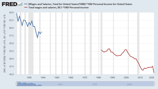 |
| Graph #5: Wages and Salaries as a Percent of Personal Income, 1921-2020 |