May 2016:
March 2014:

Friday, November 16, 2018

Frequency Error: The Plot Thickens

To get to the meat, skip down to the bold line near the bottom. To make sense of it, read the whole.

November. I'm writing up something for my econ blog. I refer to my previous look at the same topic, back in March of this year. There is a comment there from my son Jerry. He writes:
Exponential graphs are hard to look at on a linear scale like this -- the right side always looks bigger than the left side, even if it's not really. Maybe look like this?
https://fred.stlouisfed.org/graph/?g=iYoI
It does look by eyeball there like there is a pre/post 1980 change. The blue is always above the red from 1980 to 2008. Whereas they're closer for the rest of the range. I don't know if that means anything...
I looked again at Jerry's graph for the new bit I'm writing. Here's his graph:

Graph #1: Jerry's Graph, created & URL captured in March 2018; screen captured November 16th.
I also screen-grabbed the line edit setting window for each of the lines on that graph:
I captured them today, November 16th, which is to say after the recent FREDGraph revision.

I looked at them a few days ago (also after the recent FREDGraph revision) in relation to my current writing. I noticed then that the Line 1 settings say the frequency is quarterly and the Line 2 settings say the frequency is monthly. This made perfect sense to me, as those are the defaults for GDPC1 and PAYEMS respectively. I figured Jerry forgot to make them match. Here's what I wrote:
... it turns out that Jerry's graph compares quarterly growth rates (for Real GDP) to monthly rates (for employment). This makes his employment line run reliably on the low side of his GDP line (even before 1980)."
I wrote that with Full Faith and Credit that the things FRED was telling me were true. That was a mistake.

Jerry didn't compare monthly employment growth to quarterly RGDP growth. The frequency error is not his. The error is FREDGraph's. Here's how I know:

Today I was proofreading, and when I got to Jerry's Quarterly versus Monthly error and what the graph would look like with that error, I said Let me just check that. So I made a new graph:

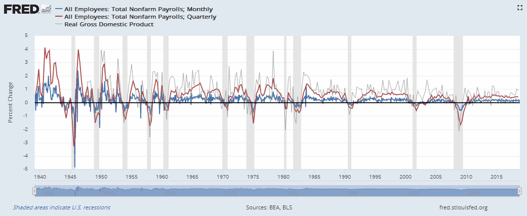
Graph #2: PAYEMS Monthly (blue) and Quarterly (red), and GDPC1 (gray)
One difference I see is in the Line Titles. On Graph #2 the blue line is identified as showing monthly data, and the red as showing quarterly data. That's correct. This is a nice feature, and new with this revision I think.

The colors on Graph #2 don't match Graph #1. My bad. What's gray on Graph #2 is blue on Graph #1. But while they differ in color, these two are identical in shape (I hope!).

The other lines (red on #1, red and blue on #2) all show PAYEMS. On Graph #2, the blue is monthly and the red is quarterly. On Graph #1 the red is quarterly but the line edit settings tell me it is monthly. The error is FREDGraph's.


For the hell of it I took Graph #2 and got the Page short URL for it. On the URL version, the titles are right. No lines are missing. And the Units settings are the same as what I had before I got the URL. Looks good!

Uh-oh! In the Edit Line Settings windows, Line 1 says Monthly frequency, which is correct; but Line 2 also says Monthly frequency, which is wrong. Looks like the frequency field is getting its information from the wrong place.

Tuesday, November 13, 2018

Before and After

At FRED they still haven't fixed the error that incorrectly saves your graph settings when you click the Page short URL option.

BEFORE

   
BEFORE   AFTER

AFTER

Click any image to see it bigger.

Sunday, October 21, 2018

Regarding that recent update of the FREDGraph system

I was trying to duplicate the Real Interest Rate graph from page 12 of James Bullard's Modernizing Monetary Policy Rules.

Bullard describes the data:
One way to get a handle on this variable is to consider the nominal return on a one-year Treasury bill and subtract the trailing 12-month inflation rate.
And again on his graph:
1-Year Treasury Rate Minus Dallas Fed Trimmed Mean PCE Inflation Rate
He made it easy to find and format the data I needed.

I got FRED's graph of the Trimmed Mean PCE Inflation Rate, brought in the 1-Year Treasury Constant Maturity Rate, and subtracted the one from the other. I grabbed the Page short URL for the graph.

Then I looked at it:

https://fred.stlouisfed.org/graph/?g=lGmc
Above the graph, on the line with the "Download" button, the calculation is correctly described. But the title of the graph reads ; Not Seasonally Adjusted. I thought they fixed that! Guess not.

But I thought the plotted line looked right, the same as what I had before I grabbed the Page short URL. So I took the next step and downloaded the data as an Excel file. Here are the first few lines of that file:


Okay, there is the Trimmed Mean PCE Inflation Rate on Row 8. But where is the 1-Year Treasury Rate?

There is no hint in the file that subtraction was done. Now I have to wonder if the numbers I got are before or after subtraction. A quick look: After, I think. But I didn't doublecheck that yet, because I'm not done finding errors.

I clicked the "Edit Graph" button and discovered that "b-a" formula I entered had changed to just "a":


No subtraction. So there you have it.

//

I started over. I put three lines on a new graph:
  1. Trimmed Mean PCE Inflation Rate,
  2. 1-Year Treasury Constant Maturity Rate, and
  3. 1-Year Treasury Constant Maturity Rate - Trimmed Mean PCE Inflation Rate
Here's the graph:


Here is a peek at the data:


A subtraction was done and downloaded.

And the formula:


So far, so good.

Next, I take the Page short URL. That's the only thing I did.

The link shows a graph that looks like this:


Wait! Where is my red line?

That graph again, showing that it does include three datasets:

(You can click the graph to see it bigger)

The red line is hidden beneath the green, because the green no longer shows the result of subtraction.

In addition, the description of the red line includes the words "Not Seasonally Adjusted". But the description of the green line includes the words "Seasonally Adjusted". Looks to me like adding the seasonal adjustment note was one of the changes made during the update. Looks to me like this is where the coding error lies. And it looks to me like they increment the index variable that returns the seasonal adjustment information, when they should be incrementing something else -- maybe the index into the list of lines on the graph. Just a guess, looking from the outside.

The downloaded data:


Lines 9 and 10 are identical. (And both say NOT seasonally adjusted. (Perhaps this is a second error in the code.))

Finally, the formula:


The formula line no longer shows subtraction. But it did before I clicked to get the Page short URL.

This is seriously weird, and weirdly serious.

Tuesday, October 2, 2018

You guys need to sit down and organize your code.

Or maybe you just need a boss who understands the importance of properly organized code. Look at this shit:


What's with that right-hand border?

And ... what does the graph show? The title says "; Seasonally Adjusted Annual Rate".

Errors like this arise because your code is not well organized. You lose things that used to work.

//

Here's the page I was looking at:


Here's the link: https://fred.stlouisfed.org/graph/?g=lqOm#0

Tuesday, February 6, 2018

This is new

I think this started happening after the recent weekend interruption of FRED service, three or four weeks ago.

I put a few different measures of debt on one graph, and everything was fine. Then I decided to show them all as annual data and index them all to 1951.

The problems that resulted may be because of a mismatch: The Federal debt is aggregated for "End of Fiscal Year" and the others are "End of Period".

Here's what I got:


1. The "Edit Line 2" window says the data is indexed to 1951. But the title line of the graph says it is indexed to 1950.

2. The sequence of the title lines (with Line 1 down at the bottom) is not my doing.

3. I was working on Line 1 when I set the units to Indexing, set the Date, and clicked the "Copy to All" button. Pretty sure, Line 1. When the screen regenerated, three of the lines were momentarily very low and one of them (Finance, probably) went high. That's more or less what I expected. But before I had a chance to look at the resulting graph, it regenerated again and came out as shown here.

4. Note that even though the "Edit Line" windows show that all four of the series are indexed to 1951, the Vertical Axis Label says that at least one of the series is given in "Billions of Dollars"

Flukey, flukey thing.

//

Yup. Okay, I got the "page short URL" link and displayed that. The one line is high on the graph and the others all low, as expected. The Vertical Axis Label says only "Index" as it should. The four lines of the title are back in the correct sequence. All as should be.

But the Federal Debt title line still says it is indexed on 1950, and the Edit Line 2 page still says 1951. Come to think of it, that's probably right.

Thursday, January 25, 2018

Liquid Liabilities


Liquid Liabilities (Broad Money) for United States (DDOI07USA648NWDB)

https://fred.stlouisfed.org/series/DDOI07USA648NWDB

The units for this series are "Millions of 2000 Dollars".
This series is inflation-adjusted.
I didn't know.
Maybe the title should say?
Or maybe if I knew what "Liquid Liabilities" is, I would know?

Anyway, here's a comparison to the CPI and the GDP Deflator:

Graph #1