May 2016:
March 2014:

Thursday, June 30, 2016

Here's a thought

At FRED for some reason they provide Household Debt Service Payments as a Percent of Disposable Personal Income, but they don't provide Household Debt Service Payments in Billions of Dollars.


Almost always (in my experience) when they offer a ratio series, they also offer the components of the ratio separately. So this would be the exception that proves the rule wrong.

I can make an assumption. I can assume that they used the DPI series when they figured the ratio. I'm pretty confident in that. And I can use DPI along with the Household DSP as a Percent of DPI series to get DSP in billions. It works for me.

It's early in the morning, though, and I have to be careful with the calculation or I'll screw it up. To get the FRED series DSP as a percent of DPI, they take the DSP/DPI ratio and multiply it by 100. Working backwards, I can take the data they give me, multiply it by DPI, and divide it by 100. It's not complicated: It's just backwards from figuring a percent. But that's what screws me up -- it's backwards.

Anyway, unless I had a massive brain fart, it looks like this:

Graph #1: Screen Capture of FRED Graph

Here's my thought. FRED could give users the option to revise the title of a graph they create, like this:

Graph #2: Edited Title

Sometimes, at least, revised titles would be appropriate.

Wednesday, June 22, 2016

His data series are GPSAVE and GPDI. I know that for a fact.

I happened upon a post from Paul Krugman from 2011. In it he says "Here’s gross private saving minus gross private investment — the private-sector financial surplus" and he shows this graph:

Graph #1: Krugman's Graph
The graph is from before both the 2016 revision and the 2014 revision to the FREDGraph system.

I know from Krugman's brief description what he is showing. And I know from from the graph itself -- from the top border -- which data series he used to make the graph. I also know (from the left border) the units for each series. So I can duplicate the graph easily:

Graph #2: Duplicating Krugman's Graph
I started my graph in 2001 like Krugman did, but didn't stop it with the 2011 data. Mine shows extra years. Also, my high point is around 1400 billion while Krugman's is less than 1200 billion. So I know there was a data revision some time between 2011 and today.

But here's the point. Suppose you wanted to duplicate my graph. Could you do it with confidence?

When I look up Gross Private Saving at FRED I get a list of 102 data series. They're not all named Gross Private Saving, but two of them are.

And when I look up Gross Private Domestic Investment FRED gives me a list of 1103 series. Turns out only two of them are named Gross Private Domestic Investment. So we are lucky this time. There are only four possible graphs we can make at FRED where the title will say Gross Private Saving minus Gross Private Domestic Investment. Given the number of options FRED gave me, it could have been more than a hundred thousand.

In 2011, there was no such ambiguity in FRED graphs.

When I started using FRED graphs, their greatest feature was their trustworthiness. You could identify the data precisely. You could identify the data units precisely. And that information came directly from FRED. You could duplicate somebody else's graph and then look at different years, or all the years. You could tweak it and try different things. But you were sure of your starting point: You knew the data and you knew the units.

That's no longer true. And that's a shame.

Ghost frames

Something that started happening only in the last month or so: Move the mouse across the graph to click something on the other side of the screen, and FRED starts generating that stupid, awful, jittery, gawky tooltip box that always hides the part of the graph you're trying to see.

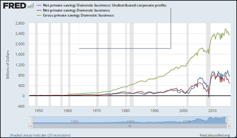
But this time you were not trying to see something on the graph. You were trying to click something, something off the graph. So FRED stops generating the tooltip box. And then your graph looks like this:


... a by-product of the recent improvements changes.

Sunday, June 19, 2016

No no, not your way. Their way, Art

Apparently, if you just type in the name of the data series you know you want (like GDP) and click ADD, it doesn't work. You have to type in the name, or part of the name, and wait for the computer to generate a list of things you might want, and then pick the one you want from the list and then click ADD.

I'll have to discover that a thousand times.

Dead Again

Well, the new version of the new FRED has been shoved down our throats.

It's got a nice feature or two (but that's not why I'm writing).

First of all they made their damn graphs so wide now that when I reduce it to fit on my blog, the text gets so small I can't read it.

Second, if you resize the graph to get the size and proportions you want, create a permalink to the resized graph, and use the permalink to see the graph, the graph goes back to "so damn wide".

Pain in my ass.

Friday, May 27, 2016

I'm just doing a quick compare of GNP and GDP, so WTF


I'm just doing a quick compare of GNP and GDP, so I figured I'd subject myself to the new FRED that is being introduced.

What's different, new to old, is that in the old system you pick your first data series, then you pick your second data series and put it with the first one, then you enter the calculation and yadda yadda. In the new system you pick your first data series, then either you go to the "put the second one with the first one" box or you go to the "figure a separate line" box, before adding the second data series. This is the biggest conceptual revision I've noticed so far in the new fred.

What would be nice would be, they should let you move or copy any of the data series from any box to any other box, or even to a new box. Eh, maybe in the 2018 revision huh?

//

What else would be nice ...

Either
don't slow me down by regenerating the graph unnecessarily (like every time I add a data series)
Or
make it so the graph stays 'fixed' in the upper half of the screen, and the buttons on the left -- now that's a nice feature, the buttons to activate the boxes -- the buttons only change what happens on the lower half of the screen
Or maybe both.

//

(idle thoughts, unfinished)

Wednesday, May 25, 2016

default image


I got GDP in the new revised fred and used SAVE/SHARE: EXPORT: IMAGE to see what the default would look like.

Here ya go:


Yeah that's useful.

For my econ blog I usually resize graphs to about 515 pixels wide.

Here is the default image, resized:


Why is it squat like that?

Can you read the numbers? Or is it more trouble than it's worth.

Oh, I can re-size the graph at FRED before I save the image. Of course. But it is an extra step. And it is two extra numbers that I have to remember. And I don't trust memory.

With the old FRED, the current FRED I mean, soon to be defunct probably for no reason that I can see, change for the sake of change, with the old FRED you could SAVE SETTINGS and it would remember the size of the graph and things like that. And then you could APPLY SETTINGS to make other graphs the same size. It didn't work very well, but at least it was an option. That option is apparently no longer available.