May 2016:
March 2014:

Saturday, September 24, 2016

Poor frequency evaluation

If you try to create a scatter plot at FRED, a lot of times you'll get an error message like this one:

For scatter plots, both plot in a pair must have the same frequency. The following plot pair has been skipped: plot #1 with frequency Quarterly, End of Period and plot #2 with frequency Quarterly, End of Quarter.

It seems to me that if it's quarterly data, "end of period" and "end of quarter" mean the same thing. If so, FRED has no valid objection to creating the scatter plot.

I think the code that checks the frequency of the data needs an update. Looks to me that they're doing a simple character-by-character text comparison, when they should be doing a little evaluation of frequency settings.

Sunday, September 11, 2016

Is it CMDEBT / GDP or is it GDP / CMDEBT ?


I just downloaded an Excel file from FRED. As it happens, I have two graphs on the screen: CMDEBT relative to GDP, and GDP relative to CMDEBT. I decided to use the data from the GDP relative to CMDEBT graph. So I downloaded that, opened the file, and glanced at the column header above the first data. CMDEBT_GDP, it says.


Did I download data from the wrong graph? I had to stop and check.

This happened to me once before, just the other day. I didn't know what the problem was, but I did notice the fluke. So I was ready for it when I found it just now.

When I first made the graph it showed CMDEBT. Then I added GDP. So I think that's what the CMDEBT_GDP is, a list of the data series in the order they are added to the graph. It definitely does not show the data relation, which is GDP / CMDEBT.

Maybe this isn't a big deal, if you know about it. But if it catches you by surprise it can mess up your work.

I don't know if this happened in the days before FRED's May 2016 revision. I don't think it did happen, but I can't say for sure.

Thursday, September 8, 2016

There's probably a reason for this...

Today is Thursday, 8 September 2016. I'm looking at the FRED series CMDEBT. Just above the graph, to the left, it tells me the value of the most recent data item (Q1 2016: 14,316.00) and when the series was last updated: Jun 9, 2016. That all makes sense.

Now, down below the graph are the Notes, and among the notes the Suggested Citation. And the citation ends thus:
... [CMDEBT], retrieved from FRED, Federal Reserve Bank of St. Louis;
https://fred.stlouisfed.org/series/CMDEBT, August 22, 2016.

Where the hell did August 22 come from? This is Thursday, 8 September. The graph was updated on 9 June.

August 22?

Tuesday, July 5, 2016

They fixed one!


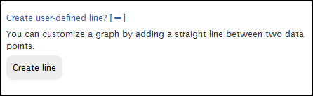
After the 2014 revision to the FRED Graph system, you could add what they called a "trend line" to your graph. I poked a little fun at that before. Here's a pic of the option they offered:


Here's a pic of the option now, after the 2016 revision:


It is no longer called a "trend" line. Now it is a "user-defined" line.

I'd like to think it was all my doing, that they no longer call the thing a trend line. I know it wasn't. But what the heck.

Thanks, guys. Thanks for fixing that.

Sunday, July 3, 2016

How about a Duplicate button

How about a Duplicate button -- so after I put together some data and a calculation, and get a line on a graph, I can hit Duplicate to put a second line on the graph based on the same data and the same calculation. Then I could revise the second line as needed, rather than recreating it from scratch.

Thursday, June 30, 2016

Here's a thought

At FRED for some reason they provide Household Debt Service Payments as a Percent of Disposable Personal Income, but they don't provide Household Debt Service Payments in Billions of Dollars.


Almost always (in my experience) when they offer a ratio series, they also offer the components of the ratio separately. So this would be the exception that proves the rule wrong.

I can make an assumption. I can assume that they used the DPI series when they figured the ratio. I'm pretty confident in that. And I can use DPI along with the Household DSP as a Percent of DPI series to get DSP in billions. It works for me.

It's early in the morning, though, and I have to be careful with the calculation or I'll screw it up. To get the FRED series DSP as a percent of DPI, they take the DSP/DPI ratio and multiply it by 100. Working backwards, I can take the data they give me, multiply it by DPI, and divide it by 100. It's not complicated: It's just backwards from figuring a percent. But that's what screws me up -- it's backwards.

Anyway, unless I had a massive brain fart, it looks like this:

Graph #1: Screen Capture of FRED Graph

Here's my thought. FRED could give users the option to revise the title of a graph they create, like this:

Graph #2: Edited Title

Sometimes, at least, revised titles would be appropriate.

Wednesday, June 22, 2016

His data series are GPSAVE and GPDI. I know that for a fact.

I happened upon a post from Paul Krugman from 2011. In it he says "Here’s gross private saving minus gross private investment — the private-sector financial surplus" and he shows this graph:

Graph #1: Krugman's Graph
The graph is from before both the 2016 revision and the 2014 revision to the FREDGraph system.

I know from Krugman's brief description what he is showing. And I know from from the graph itself -- from the top border -- which data series he used to make the graph. I also know (from the left border) the units for each series. So I can duplicate the graph easily:

Graph #2: Duplicating Krugman's Graph
I started my graph in 2001 like Krugman did, but didn't stop it with the 2011 data. Mine shows extra years. Also, my high point is around 1400 billion while Krugman's is less than 1200 billion. So I know there was a data revision some time between 2011 and today.

But here's the point. Suppose you wanted to duplicate my graph. Could you do it with confidence?

When I look up Gross Private Saving at FRED I get a list of 102 data series. They're not all named Gross Private Saving, but two of them are.

And when I look up Gross Private Domestic Investment FRED gives me a list of 1103 series. Turns out only two of them are named Gross Private Domestic Investment. So we are lucky this time. There are only four possible graphs we can make at FRED where the title will say Gross Private Saving minus Gross Private Domestic Investment. Given the number of options FRED gave me, it could have been more than a hundred thousand.

In 2011, there was no such ambiguity in FRED graphs.

When I started using FRED graphs, their greatest feature was their trustworthiness. You could identify the data precisely. You could identify the data units precisely. And that information came directly from FRED. You could duplicate somebody else's graph and then look at different years, or all the years. You could tweak it and try different things. But you were sure of your starting point: You knew the data and you knew the units.

That's no longer true. And that's a shame.