May 2016:
March 2014:

Saturday, April 26, 2025

The glitch is in my head

Something that never came up until we had the pandemic recession, because the recession was so short:

The whole year's RGDP for 2020 shows up on the graph before the 2020 recession. When I first noticed this, it really threw me. It's even more confusing (and easier to miss) for quarterly data.

I understand that the 2020 data point is shown at start-of-year. But somehow I missed the significance of that for several years.

Signed,
senile math major

Friday, April 18, 2025

Oh!

I just noticed that the FRED system now SHOWS ME that my CPI data has been converted to "annual" frequency using "average" aggregation.

THANK YOU!

Monday, April 14, 2025

I can't figure out what's going on with this

In the "Format" window for formatting a FRED graph, sometimes the Height and Width fields for size-of-graph are there, and sometimes they are missing.

If it has to be that way, so be it. I'm hoping it's just an oversight that can be fixed.

Friday, February 28, 2025

Oh, you made my day!

 I just found the Height and Width options for graph size:


Thank you so much. You have simplified my life.


Truth be told, the height and width fields might have been there for weeks, dunno. I only just noticed em now. Looks good, too.

Thursday, January 30, 2025

Oh!

I just got a message that FREDGraph left a line off my graph and I might want to uncheck the LogScale option.

Thank you!

Saturday, December 21, 2024

Oh, my head is spinning now

I don't like change. So I looked at the "Enhanced Graph Accessibility" option, tried it out, and went back to the old edit system. That was a few days ago.

Today I was finishing up a graph, and wanted to change the color of Line 5. But I could not, because the color-change window (in the old edit system) now appears halfway off the screen. I could not scroll the screen to access the color-data field because scrolling the screen makes the color-change window disappear. 

I was going to blog that problem. But then I remembered the new system. I switched to the new system and changed the color easily. Then I changed the line type from SOLID to DASH, and the graph was done.

I was all set to set the size to 800x450 and download the image. That's when I discovered that I could not find the set-graph-size fields in the Enhanced system. So I went back to the old edit system and set the size there, no problem. Then I looked at my graph.

Problema! Line 5 appears as a SOLID line in the old system. I switched to the Enhanced system, and checked: In the new system the line is DASHed. I switched again to the old system and checked: In the old system the line is SOLID.

My new-system graph is  https://fred.stlouisfed.org/graph/?g=1Cnix

In the old system I'm editing line 5 to make it DASHed.
The line changed to DASHed, as expected.
I saved it in the old system as:  https://fred.stlouisfed.org/graph/?g=1Cnku

I opened 1Cnku in a new window, and the line came up SOLID. 

I went back to the original 1Cnku, where line 5 was DASHed, and refreshed the screen. Line 5 came up SOLID here, too.

Yikes!

Okay. I reloaded 1Cnix, the one where I changed the color for line 5, and the line type to DASHed. Line 5 came up as solid here, too. Looks to me like it makes the change on the screen, but does not save it (Share Links: Page Short URL") in EITHER system.

I need a drink!

Thursday, November 7, 2024

Line width

This morning, the first line I put on the graph has a default line width of 2, and the second line has a default line width of 3. That happened three times. The third line also has a default line width of 3. Looks like a glitch to me.

Not a problem, but I can't ignore it until after I say something.

Oh, and the "Sources" information has been reformatted? Looks good!

Thursday, February 22, 2024

Oh, I like this!

Not a test. I need the Rasche data, either quarterly or annual, I'm not
sure yet, plus the above datasets for the years since 1959! Thank you.

Maybe I should change the name of this blog, huh.

Saturday, November 18, 2023

Don't Freq Out

So I put Nonfarm Business Sector: Labor Share for All Workers  (PRS85006173) on a graph. This data (series a) is quarterly by default. Everything was good.

Then I added a second series (series b) in the "Edit Line 1" window: Shares of gross domestic income: Compensation of employees, paid  (A4002E1A156NBEA). This series is annual by default.

But the Labor Share data was still displayed at quarterly frequency. This surprised me, especially as the frequency was shown as "Annual" in the Edit-Line-1 window.

I changed the formula to display series b. The screen refreshed and this data was correctly displayed as annual. Then I switched back to series a, and it now displayed as annual.

I was starting to think everything was okay, and then I looked at the graph title. The title said "Not Seasonally Adjusted". I switched back to series b, and the title was good. I switched back to series a, and again the title said "Not Seasonally Adjusted".

Friday, November 10, 2023

Around 4:30 this morning...

 Looking at a handful of Real GDP series,


 I was going for an end date of 1991.

I love it!

Sunday, May 21, 2023

"What Dates Are Used for the U.S. Recession Bars?"

The page says:

At times, the months and quarters of the business cycle turning points do not align. To learn more, see the FRED Blog post “Discrepancies in dating recessions.

Nope.


Perhaps this:

https://fredblog.stlouisfed.org/2021/08/discrepancies-in-dating-recessions/


ps, I find that sort of information useful.

Friday, May 5, 2023

Annual aggregation of Quarterly debt using EOP

I catch myself lately noticing little improvements in the FRED graphing system. Little things, so that I'm not even sure there was a change. But I do notice them, and I do like what I see. My thanks to all at FRED.

I test things.

Quarterly debt data like TCMDO is given as "Quarterly, End-of Period". Debt data is always given as end-of-period, I think -- and I think this makes sense, even though I have to make up my own reasons that it might.

The quarterly series GDP, converted to annual values, appears to best match the annual series GDPA when GDP is aggregated using the "average" option, not End-of-Period. So this tells me that GDPA is figured from quarterly data by "average" and not by EOP. I am not surprised by this, as GDP is not debt data.

I pay attention to these things because it matters at least a little in the resulting graphs.

Now my complaint...

If I take a quarterly debt series and convert it to annual using EOP, everything is fine until I grab the "page short URL" for the graph and use that link to access the graph. 

The problem is that the Edit Window (for the page-short-URL version) tells me the quarterly data was converted to annual using the "average" option when I know perfectly well that I used EOP.

I don't know if the Edit window is telling me the truth. Maybe the problem is only that the "aggregation method" field is not updated. Or maybe the problem is more complicated. Dunno.

Thanks for listening.

Tuesday, February 21, 2023

Dropping the first year's data...

Same topic as the previous post, which I didn't show til this morning.

I  got TCMDODNS

converted the frequency to ANNUAL and the aggregation method to END OF PERIOD.

The graph shows data beginning with 1946.

But the excel download shows data beginning with 1947.

It would be GREAT if the download began with 1945. As it stands, I retrieve that item using "+more" and "ViewAll" in the "observation" box, just above the graph on the left.

PS: I love FRED

Tuesday, January 24, 2023

I need details and more checking


Happened twice in the last two days: I make a graph of one series divided by another. The graph shows data starting in 1946. I export the data to Excel. Excel shows data starting in 1947.


Saturday, October 16, 2021

Religiously. I do it religiously

So, I set my FRED graphs to 800 pixels wide by the default height, 450 I think. I even keep my browser set at a width that gives me the 800-pixel graph width automatically. Or anyway I did, until a recent update of the FREDGraph system.

Now I get the graph all set up as I want it, 800 pixels wide and all, and use the Firefox browser's "take a screenshot" button to perfectly capture the image -- the button "knows" where the edges of the graph are, so it is easy to capture an image that needs no cropping.

I used this method religiously. Since the update, it no longer works as expected.

This time, instead of opening the file after saving it, I right-clicked it and clicked "Properties". The "Details" tab tells me that the size of the image is 640 x 360.

Saturday, September 18, 2021

It's back

When the edit window opens, the graph is resized to be less wide. The line-title text wraps automatically, and the second line-title is over-written:


I had not seen this error for some time. It came back in the last month or so, perhaps as a result of the recent updating that was noted at the top of the  https://fred.stlouisfed.org/  page.

This is definitely a glitch that comes and goes. I think fixing something else brings it back.

Thursday, August 19, 2021

Personal Income for United States (Q0868AUSQ027SNBR)

To convert Q0868AUSQ027SNBR to annual, try the aggregation method "sum" instead of "average" or "end of period".


I want to document this. I hope it's not a painful read.

Looking for the "Wages and Salaries" share of income at FRED, I found


Looking for income I found

and of course


All of these provide annual data except the two that start in 1921, which are quarterly. That caught me by surprise. Almost always at FRED, if it goes back before 1947 it is annual.

All of them are "not seasonally adjusted" except, again, the two that start in 1921, the quarterlies.

There is something else about these two series: a difference that caught me off guard. The notes for the Q088 file (disposable personal income) say

These Data Are Quarterly Totals At Annual Rates. The Figures Represent Quarterly Totals Multiplied By 4.

The notes for the Q086 file (personal income) don't say that. I noticed, but it didn't register.

From the given data I made a graph to compare "wages and salaries" to "disposable personal income" for 1921 to 2020:

https://fred.stlouisfed.org/graph/?g=Gccx

But then it occurred to me that comparing to personal income would make a better measure. So I added the Q086 series and revised the calculation for the blue line. The graph went crazy on me:

Graph #2

Wages and salaries can't be 240% of Personal Income. I checked to make sure I had the right data series and the right calculation. All good. But something was wrong.

If I was alert I might have realized that the blue line, at around 240, was about four times what it should have been. That would have been a clue. But ...

Anyway, I made a new graph just to compare the Q086 "Personal Income for United States" to the A065 "Personal Income" that starts in 1929. I converted the quarterly Q086 data to annual using the default aggregation method, "average", the one I almost always use. And I ended the graph at 1950 so I could see the early years:

Graph #3

Hey, I know old data is sometimes set aside because accounting methods change and the old data doesn't match. But can it be this far off? I don't think so. It must be me.

I changed the Q086 aggregation method to "end of period", the one I often use for debt data. But if the graph changed at all, I didn't notice. Then I happened to look at the values for 1941, where the blue line ends. The blue value was around 25 (billion); the red was near 100.

Four times as much.

Four quarters in a year.

And

The notes for the Q088 file (disposable personal income) say

These Data Are Quarterly Totals At Annual Rates. The Figures Represent Quarterly Totals Multiplied By 4.

The notes for the Q086 file (personal income) don't say that.

Now it was starting to make sense. Almost always at FRED, when the data is quarterly and seasonally adjusted, they identify it as a "seasonally adjusted annual rate". GDP is given that way, for example. And the  Q088 file is identified as "Quarterly Totals At Annual Rates". But the Q086 file is not. I have to sum the quarterly values to get annual values. I get it now.

I changed the aggregation method to "sum", the option I never use. This time the graph changed. This time, the data matched:

Graph #4

Not only did it match; it was almost a perfect match!


I had to reconstruct the graph I wanted, the "wages and salaries" relative to "personal income" graph, starting with Q086 and choosing annual frequency and "sum" aggregation. The A081 data (Wages and Salaries, 1919-1939) is already annual, so I lose the chance to choose an aggregation method when I bring this series in. A tedious detail, perhaps. But if you do it right, it works:
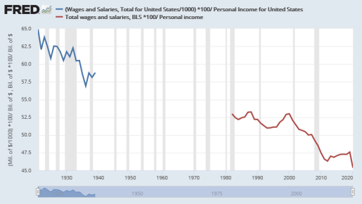
Graph #5: Wages and Salaries as a Percent of Personal Income, 1921-2020


Saturday, December 19, 2020

"Persons 16 years of age and older." That's it??

The notes for Population Level (CNP16OV) say:


Civilian noninstitutional population is defined as persons 16 years of age and older residing in the 50 states and the District of Columbia, who are not inmates of institutions (e.g., penal and mental facilities, homes for the aged), and who are not on active duty in the Armed Forces.


The notes for Civilian Labor Force Level (CLF16OV) say:

Persons 16 years of age and older.

which makes the labor force more inclusive than the population. That's not right.


Those notes, by the way, are usually very helpful. Not being an economist, I depend on them. I trust them. This is the first time I ever saw one so obviously wrong.


Also, the date in the citation is wrong. That's weird.